Field Notes · Vol. 01

The reasoning behind the room.

Six short notes on how Solace was made — what we named, what we removed, and why the film opens on an empty window. Written for the people who look past the finished thing to ask how the decisions were arrived at.

Six notesApprox. 9 min readBatch 0417

Naming the hour, not the product.

Every brand in the sleep category owns morning or midnight. Solace owns the specific window in between.
Woman photographed at true blue hour

The category is crowded with two claims: 'wake up better' and 'fall asleep faster.' Both are outcomes. Neither is a moment.

'The hour between waking and rest' locates the brand in a shared, felt experience — the exhale after the day. Positioning becomes a place, not a promise, and gives every downstream decision (palette, music, cadence, copy) a real reference.

This is why the homepage opens with an hour and not with a headline about sleep.
Amber apothecary, ink, bone.

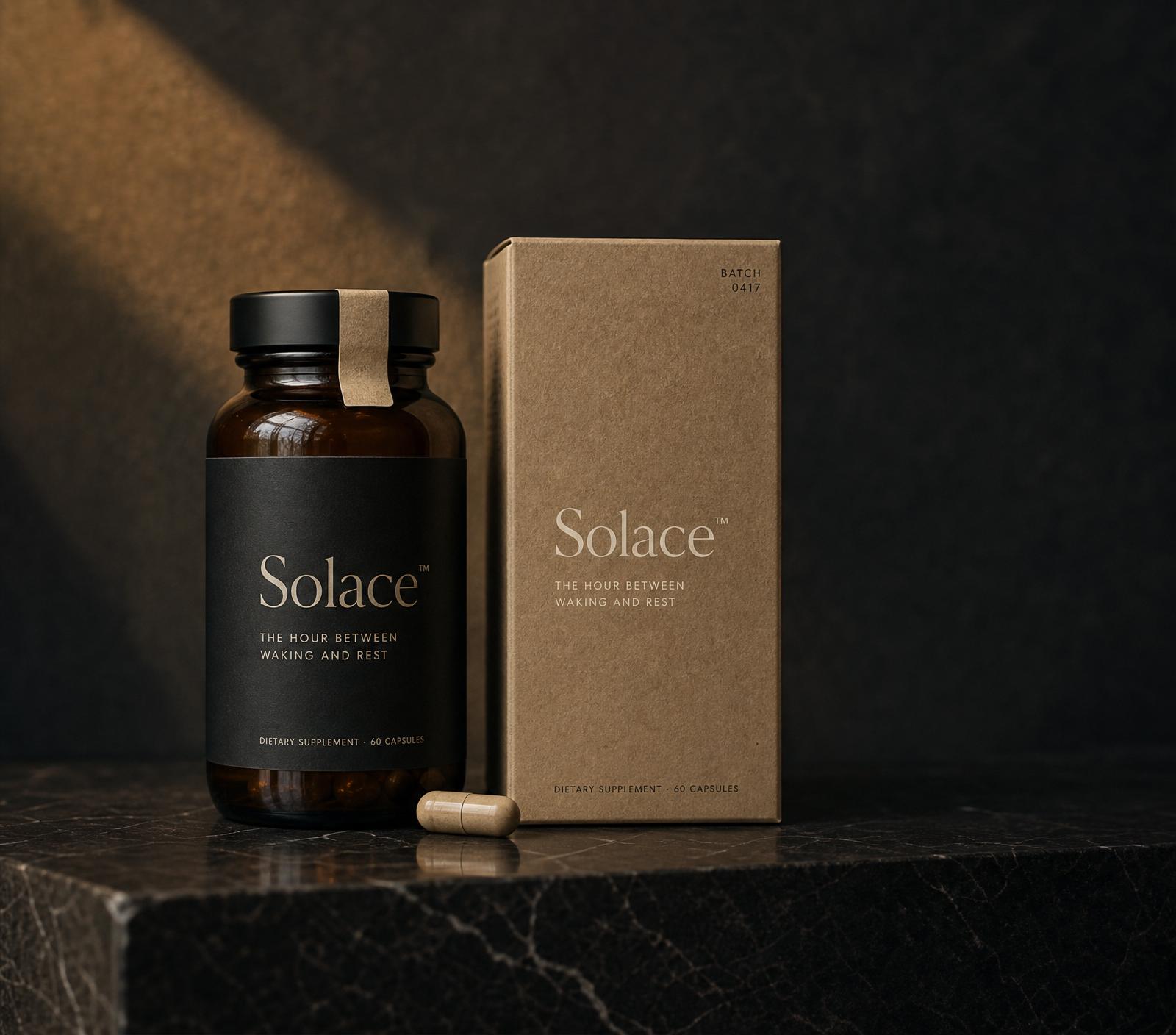
The palette is drawn from the two minutes of the day the brand claims: amber horizon, ink sky, bone paper on the nightstand.

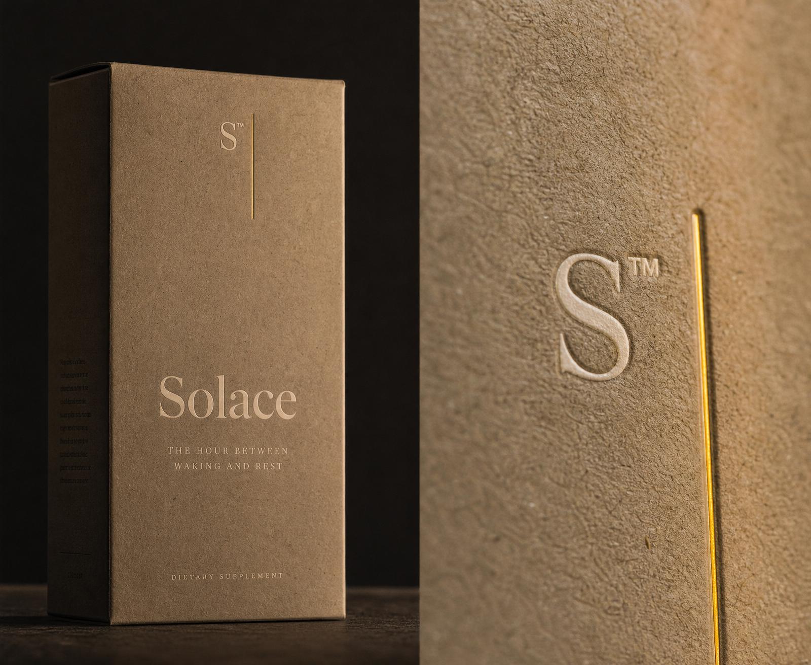
Amber apothecary bottle and bone cardstock packaging

Ink (#14141C) sets the room after sundown. Amber (#BD8A47) is the last warm light on the horizon. Bone (#F6F1E7) is the uncoated cardstock the object arrives on.

No pure white, no pure black — every neutral is warmed. The paper grain overlay is fixed at ~4% opacity across large color blocks so screens feel closer to print than to product photography.

Type pairs Fraunces (a modern optical serif) with Inter, and lets JetBrains Mono do the small, technical work — dosages, batch numbers, sourcing. The mono is what separates a wellness label from an apothecary one.

The room dims, once.

The page performs the hour it names — but exactly once, and never enough to notice on the second scroll.

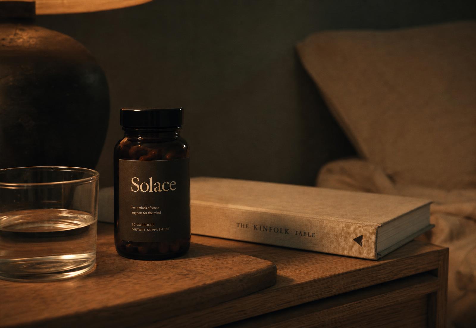
Amber bottle in dusk light

The hero background interpolates from ink toward plum as the user scrolls the first 800px. It is capped, one-directional, and imperceptible on any single frame. What the user feels is not animation; it is the room getting darker.

The bottle breathes at 9 seconds per cycle — an 8px lift, a 1% scale, a 5% brightness swell. The amber halo pulses on a slower, offset 11-second curve so the two never sync. Nothing pulses at heart-rate speed; nothing loops in the foveal field.

Sections reveal on entry with a 1.4s ease-out on opacity, translate, and blur — long enough to feel like a fade in a film cut, short enough that no user waits.

All motion respects prefers-reduced-motion.

Publish the milligrams.

The formulation ledger reads like a spec sheet on purpose. Sourcing city, dose, absorbed form.

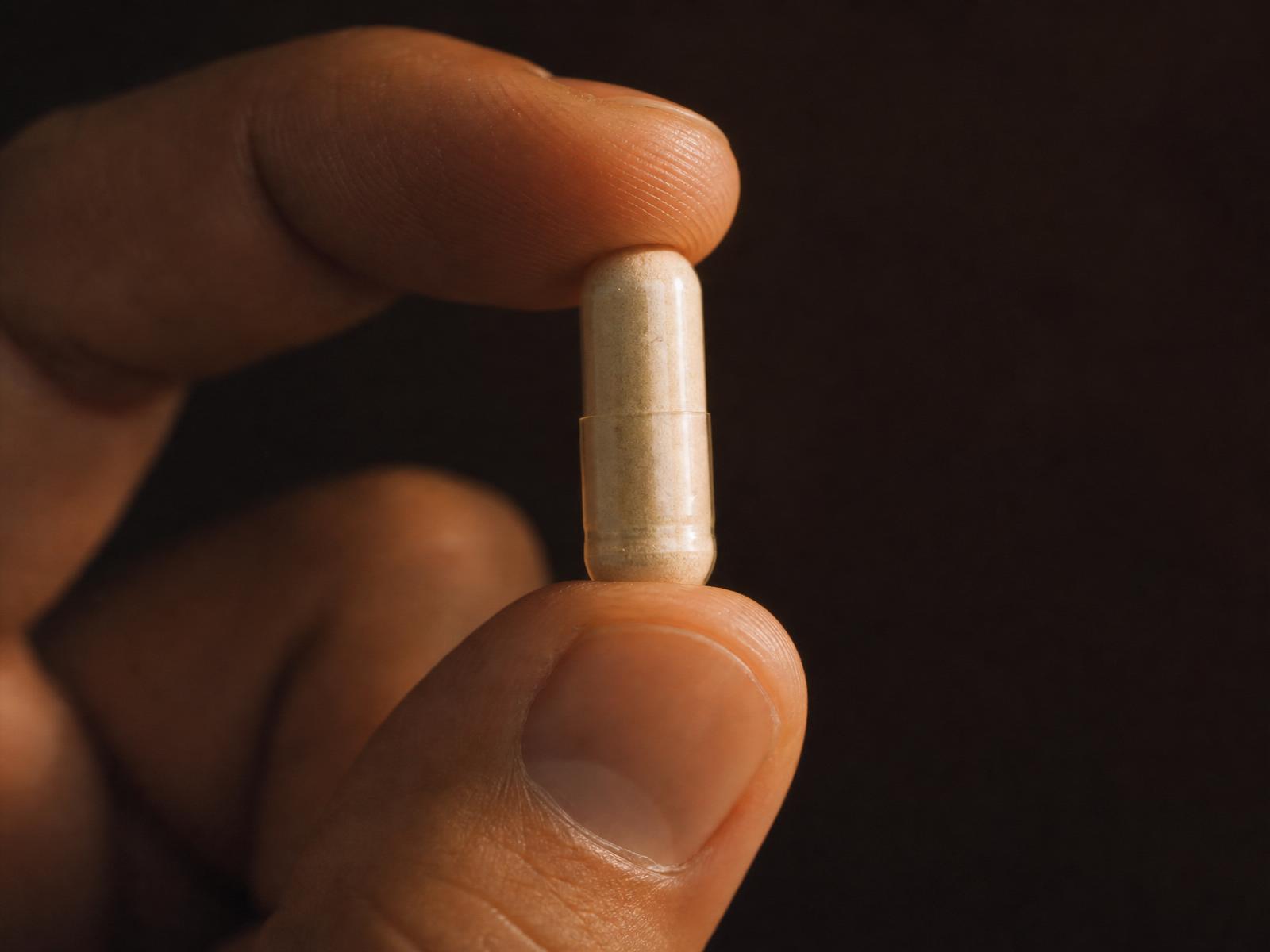
Magnesium crystal inside a translucent capsule

The premium sleep customer has read the studies. They know Suntheanine® from L-theanine powder, and KSM-66 from generic ashwagandha. Hiding the doses inside a 'proprietary blend' loses them in the first paragraph.

So the science section is a mono-set ledger — six ingredients, milligrams visible, single sourcing city per line. No hero ingredient, no starred callout. Confidence in the formulation is expressed as willingness to be audited.

It also gives the copy a texture no wellness competitor has: technical, restrained, closer to a good wine list than a supplement bottle.

Show the asset in its native frame.

Recruiters and buyers see the same slide-deck screenshots. So Solace's assets are recreated in the environments they'd actually live in.

Instead of exporting a JPEG of a Facebook ad, /campaign/meta rebuilds the feed around it — sidebar, story reel, comment thread, the correct sponsored label. The ad is the only real thing on the page; everything around it is scaffolding, but the scaffolding is what makes the ad believable.

The Google ad sits in a real SERP. The email sequence opens in a mac Mail three-pane. The VSL runs inside a premium player with a scrubbable storyboard.

The point is not verisimilitude for its own sake. It's that a great ad only reads as great when you feel the friction of the environment it's competing against.

Open on nothing.

The VSL's first six seconds are a still room at blue hour, no voiceover, no product.

Sleep advertising almost always starts with the problem: a wired executive, a bright phone, a stressed shoulder. That opening puts the viewer into the state the product is supposed to relieve, which is exactly wrong.

Solace's film opens on the state it wants the viewer in — a quiet window, ambient light falling, the bottle out of focus in the corner. The voiceover arrives at 0:07, low and unhurried. The product appears at 1:24. The CTA is a single line on a black frame at 3:04.

It's not a demonstration of the product. It's a demonstration of the mood the product buys back.

Colophon

Made in the open.

TypeFraunces · Inter · JetBrains Mono
PaletteInk #14141C · Amber #BD8A47 · Bone #F6F1E7 · Plum #3B2A38
GrainFractal noise, 4% opacity, overlay blend
MotionEase cubic-bezier(0.32, 0.72, 0.24, 1) · one-directional dusk fall · 9s / 11s breath cycles
AssetsAmber apothecary bottle, capsule macro, blue-hour portrait, packaging spread
WrittenOjai, California · Batch 0417 · 04.11.2026

Return to the room.